- Published on
VUE3封装消息对话框组件
- Authors

- Name
- Monster Cone
因为要满足 UI 设计,所以直接使用库的 Dialog 需要调整的 style 太多了,还要增加项目大小,因此直接抛弃了 UI 库,自己封装。
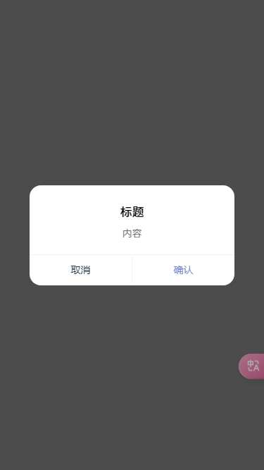
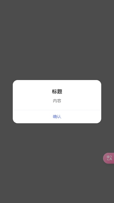
效果图
组件代码
Template
<template>
  <div
    ref="MessageBoxRef"
    v-show="visible"
    class="message-mask"
    :class="{ [`${customClass}`]: true }"
    :style="{ zIndex: zIndex }"
    @click.self="handleClickModal"
  >
    <div class="box center">
      <div class="content">
        <h1 class="title">{{ title }}</h1>
        <p class="message">{{ message }}</p>
      </div>
      <div class="btn__group">
        <button
          v-if="showCancalButton"
          class="btn btn__cancal"
          :style="{ '--color': cancalColor }"
          @click="handleAction('cancel')"
        >
          {{ cancalText }}
        </button>
        <button
          class="btn btn__confirm"
          :style="{ '--color': confirmColor }"
          @click="handleAction('confirm')"
        >
          {{ confirmText }}
        </button>
      </div>
    </div>
  </div>
</template>
Script
Props
const props = defineProps({
  title: {
    // 标题
    type: String,
    default: () => '',
  },
  message: {
    // 提示
    type: String,
    default: () => '',
  },
  confirmText: {
    // 确认按钮文案
    type: String,
    default: () => '确认',
  },
  cancalText: {
    // 取消按钮文案
    type: String,
    default: () => '取消',
  },
  confirmColor: {
    // 确认按钮颜色
    type: String,
    default: () => '#6a7fdb',
  },
  cancalColor: {
    // 取消按钮颜色
    type: String,
    default: () => '',
  },
  closeOnClickModal: {
    // 是否点击遮罩层关闭
    type: Boolean,
    default: () => true,
  },
  customClass: {
    // 自定义class
    type: String,
    default: () => '',
  },
  showCancalButton: {
    // 是否显示取消按钮
    type: Boolean,
    default: () => true,
  },
  useAnimation: {
    // 是否使用动画
    type: Boolean,
    default: () => true,
  },
})
自定义 zIndex 递增 Hook
// useIndex.ts
import { ref, computed } from 'vue'

const initialZIndex = 2e3
const zIndex = ref(0)
const useZIndex = () => {
  const currentZIndex = computed(() => initialZIndex + zIndex.value)
  const nextZIndex = () => {
    zIndex.value++
    return currentZIndex.value
  }
  return {
    nextZIndex,
  }
}

export default useZIndex
初始 zIndex 为 2000,每次调用 useZIndex 方法都会自增再返回新的 zIndex。保证多个 Message 时不会重叠。
组件挂载
const zIndex = ref(0)
const { nextZIndex } = useZIndex()

const hideBody = () => {
  document.body.classList.add('message-overflow-hidden')
}

const fadeIn = async () => {
  return new Promise((resolve) => {
    MessageBoxRef?.value.classList.add('fade-in')
    setTimeout(() => {
      MessageBoxRef?.value.classList.remove('fade-in')
      resolve(null)
    }, 300)
  })
}

onMounted(() => {
  zIndex.value = nextZIndex()
  nextTick().then(() => ((visible.value = true), hideBody(), props.useAnimation && fadeIn()))
})
先获取新的 zIndex,在元素已经挂载到目标元素上后显示组件,同时禁止滚动,如果使用动画,添加 animation class。
message-overflow-hidden class 不能定义在 scoped 作用域的 style 标签。
事件交互
const fadeOut = async () => {
	return new Promise(resolve => {
		MessageBoxRef.value?.classList.add('fade-out')
		setTimeout(() => {
			MessageBoxRef.value?.classList.remove('fade-out')
			resolve(null)
		}, 250)
	})
}

const showBody = () => {
	document.body.classList.remove('message-overflow-hidden')
}

const handleClickModal = () => {
	if (props.closeOnClickModal) handleAction('close')
}

const handleAction = (type: any) => {
	action.value = type
	doClose()
}

const doClose = async () => {
	if (!visible.value) return
	if (props.useAnimation) await fadeOut()
	visible.value = false
	showBody()
	nextTick(() => {
		if (action.value) emits('action', action.value)
	})
}
任何事件都先修改 action 值,再调用关闭方法。如果使用动画,等待动画调用完成再隐藏。然后放开滚动,抛出事件。
因为动画时长默认是 300 毫秒,因此移除 fade-out 需要小于 300 毫秒,否则会导致样式闪烁
组件实例封装
底层实现
import { createVNode, render } from 'vue'
import Message from './Message.vue'
import { MessageOptions, ActionType } from './types'

const messageInstance = new Map()

const getContainer = (): HTMLElement => {
	return document.createElement('div')
}

const initInstance = (props: MessageOptions, container: HTMLElement) => {
	const vnode = createVNode(Message, props)
	render(vnode, container)
	document.body.appendChild(container.firstElementChild)
	return vnode.component
}

const showMessage = (options: MessageOptions) => {
	const container = getContainer()

	options.onAction = (action: ActionType) => {
		const curInstance = messageInstance.get(vm)
		setTimeout(() => {
			render(null, container)
			messageInstance.delete(vm)
		}, 0)
		switch (action) {
			case 'confirm':
				return curInstance.resolve(curInstance.resolve)
			case 'cancel':
				return curInstance.reject('cancal')
			case 'close':
				return curInstance.reject('close')
		}
	}

	const instance = initInstance(options, container)

	const vm = instance.proxy

	for (const prop in options) {
		if (options.hasOwnProperty(prop) && !vm.$props.hasOwnProperty(prop)) {
			vm[prop] = options[prop]
		}
	}

	return vm
}

const MessageBox: MessageBoxInstance = async (options: MessageOptions): Promise => {
	const container = document.createElement('div')
	return new Promise((resolve, reject) => {
		const vm = showMessage(options)
		messageInstance.set(vm, {
			options,
			resolve,
			reject
		})
	})
}
此处参考了 element-plus 的封装方式。定义 MessageBox 方法,返回 Promise 回调,同时将 Promise 的回调方法添加到 Map 对象中。showMessage 方法在 props 上 添加 onAction 方法监听 action 回调。然后将组件挂载到目标元素上,将参数赋值给组件实例,并返回。
onAction 方法可以接收组件通过 defineEmits 定义的事件。从 Map 对象中获取当前组件的 Promise 回调,判断事件调用对应的回调方法。在完成对话的时候我们还需要销毁元素,通过 setTimeout 将 null 渲染到目标元素上,同时删除 Map 中的组件实例。
方法扩展
const MESSAGE_BOX_FUNC: string[] = ['confirm', 'alert']
const MESSAGE_INIT_PROPS = {
  confirm: { showCancalButton: true },
  alert: { showCancalButton: false, closeOnClickModal: false },
}

const MessageBoxInit: MessageBoxInstance = (type: string) => {
  return (title: string, message: string, options: MessageOptions) => {
    return MessageBox({
      title,
      message,
      type,
      ...options,
      ...MESSAGE_INIT_PROPS[type],
    })
  }
}

MESSAGE_BOX_FUNC.forEach((type: string) => {
  MessageBox[type] = MessageBoxInit(type)
})

MessageBox.close = () => {
  messageInstance.forEach((_, vm) => {
    vm.doClose()
  })

  messageInstance.clear()
}
MESSAGE_BOX_FUNC 定义了两个对话框类型,MESSAGE_INIT_PROPS 定义他们的相关参数,MessageBoxInit 方法扩展参数便于调用,最后再整合参数调用 MessageBox 方法。遍历 MESSAGE_BOX_FUNC,将 type 挂载到 MessageBox 的原型上。在 MessageBox 原型上再添加一个 close 方法清空所有的对话框。
组件使用
<template>
  <button @click="handleConfirm">点我试试Confirm</button>
  <button @click="handleAlert">点我试试Alert</button>
</template>
<script setup lang="ts">
import Message from './XX/MessageBox'
const handleConfirm = () => {
  Message.confirm('标题', '内容')
    .then((_) => {
      // do something
    })
    .catch((_) => {
      // do something
    })
}

const handleAlert = () => {
  Message.alert('标题', '内容')
    .then((_) => {
      // do something
    })
    .catch((_) => {
      // do something
    })
}
</script>
完整代码
import { createVNode, render } from 'vue' import Message from './Message.vue' import {
MessageOptions, ActionType } from './types' const messageInstance = new Map() const getContainer =
(): HTMLElement => { return document.createElement('div') } const initInstance = (props:
MessageOptions, container: HTMLElement) => { const vnode = createVNode(Message, props) render(vnode,
container) document.body.appendChild(container.firstElementChild) return vnode.component } const
showMessage = (options: MessageOptions) => { const container = getContainer() options.onAction =
(action: ActionType) => { const curInstance = messageInstance.get(vm) setTimeout(() => {
render(null, container) messageInstance.delete(vm) }, 0) switch (action) { case 'confirm': return
curInstance.resolve(curInstance.resolve) case 'cancel': return curInstance.reject('cancal') case
'close': return curInstance.reject('close') } } const instance = initInstance(options, container)
const vm = instance.proxy for (const prop in options) { if (options.hasOwnProperty(prop) &&
!vm.$props.hasOwnProperty(prop)) { vm[prop] = options[prop] } } return vm } const MessageBox:
MessageBoxInstance = async (options: MessageOptions): Promise => { const container =
document.createElement('div') return new Promise((resolve, reject) => { const vm =
showMessage(options) messageInstance.set(vm, { options, resolve, reject }) }) } const
MESSAGE_BOX_FUNC: string[] = ['confirm', 'alert'] const MESSAGE_INIT_PROPS = { confirm: {
showCancalButton: true }, alert: { showCancalButton: false, closeOnClickModal: false } } const
MessageBoxInit: MessageBoxInstance = (type: string) => { return (title: string, message: string,
options: MessageOptions) => { return MessageBox({ title, message, type, ...options,
...MESSAGE_INIT_PROPS[type] }) } } MESSAGE_BOX_FUNC.forEach((type: string) => { MessageBox[type] =
MessageBoxInit(type) }) MessageBox.close = () => { messageInstance.forEach((\_, vm) => {
vm.doClose() }) messageInstance.clear() } export default MessageBox
<template>
  <div
    ref="MessageBoxRef"
    v-show="visible"
    class="message-mask"
    :class="{ [`${customClass}`]: true }"
    :style="{ zIndex: zIndex }"
    @click.self="handleClickModal"
  >
    <div class="box center">
      <div class="content">
        <h1 class="title">{{ title }}</h1>
        <p class="message">{{ message }}</p>
      </div>
      <div class="btn__group">
        <button
          v-if="showCancalButton"
          class="btn btn__cancal"
          :style="{ '--color': cancalColor }"
          @click="handleAction('cancel')"
        >
          {{ cancalText }}
        </button>
        <button
          class="btn btn__confirm"
          :style="{ '--color': confirmColor }"
          @click="handleAction('confirm')"
        >
          {{ confirmText }}
        </button>
      </div>
    </div>
  </div>
</template>

<script lang="ts" setup>
import { ref, defineProps, defineEmits, nextTick, onMounted, watch } from 'vue'
import useZIndex from './useIndex'

const emits = defineEmits(['confirm', 'cancel', 'action'])

const props = defineProps({
  title: {
    type: String,
    default: () => '',
  },
  message: {
    type: String,
    default: () => '',
  },
  confirmText: {
    type: String,
    default: () => '确认',
  },
  cancalText: {
    type: String,
    default: () => '取消',
  },
  confirmColor: {
    type: String,
    default: () => '#6a7fdb',
  },
  cancalColor: {
    type: String,
    default: () => '',
  },
  closeOnClickModal: {
    type: Boolean,
    default: () => true,
  },
  customClass: {
    type: String,
    default: () => '',
  },
  showCancalButton: {
    type: Boolean,
    default: () => true,
  },
  useAnimation: {
    type: Boolean,
    default: () => true,
  },
})

const MessageBoxRef = ref<any>(null)
const visible = ref<boolean>(false)
const action = ref<string>('')
const zIndex = ref<number>(0)
const { nextZIndex } = useZIndex()

onMounted(() => {
  zIndex.value = nextZIndex()
  nextTick().then(() => ((visible.value = true), hideBody(), props.useAnimation && fadeIn()))
})

const handleClickModal = () => {
  if (props.closeOnClickModal) handleAction('close')
}

const handleAction = (type: any) => {
  action.value = type
  doClose()
}

const doClose = async () => {
  if (!visible.value) return
  if (props.useAnimation) await fadeOut()
  visible.value = false
  showBody()
  nextTick(() => {
    if (action.value) emits('action', action.value)
  })
}

const hideBody = () => {
  document.body.classList.add('message-overflow-hidden')
}

const showBody = () => {
  document.body.classList.remove('message-overflow-hidden')
}

const fadeIn = async () => {
  return new Promise((resolve) => {
    MessageBoxRef?.value.classList.add('fade-in')
    setTimeout(() => {
      MessageBoxRef?.value.classList.remove('fade-in')
      resolve(null)
    }, 300)
  })
}

const fadeOut = async () => {
  return new Promise((resolve) => {
    MessageBoxRef.value?.classList.add('fade-out')
    setTimeout(() => {
      MessageBoxRef.value?.classList.remove('fade-out')
      resolve(null)
    }, 250)
  })
}
</script>
<style scoped>
* {
  box-sizing: border-box;
  margin: 0;
  padding: 0;
}
button {
  outline: none;
  border: none;
  background-color: transparent;
}
.message-mask {
  position: fixed;
  top: 0;
  left: 0;
  display: grid;
  place-items: center;
  padding: 0 42px;
  height: 100vh;
  width: 100%;
  background-color: rgba(0, 0, 0, 0.7);
}
.message-mask .box {
  width: 100%;
  max-width: 100%;
  max-height: 90vh;
  display: flex;
  flex-direction: column;
  border-radius: 16px;
  background-color: #fff;
}
.message-mask .box.center {
  text-align: center;
}
.message-mask .content {
  flex: 1;
  padding: 24px 0 20px;
  width: 100%;
  display: flex;
  flex-direction: column;
}
.message-mask .title {
  font-size: 17px;
  font-family:
    PingFangSC-Medium,
    PingFang SC;
  font-weight: 500;
  color: #000000;
  line-height: 26px;
  word-wrap: break-word;
}
.message-mask .message {
  flex: 1;
  max-height: 60vh;
  padding: 0 24px;
  margin-top: 6px;
  font-size: 14px;
  font-family:
    PingFangSC-Regular,
    PingFang SC;
  font-weight: 400;
  color: #000000;
  line-height: 22px;
  opacity: 0.6;
  word-wrap: break-word;
  overflow: auto;
}
.message-mask .btn__group {
  height: 44px;
  line-height: 44px;
  display: flex;
  flex-direction: row;
  border-top: 1px solid #f0f1f4;
}
.message-mask .btn__group > .btn {
  flex: 1;
  width: 100%;
  font-size: 14px;
  color: var(--color);
  text-align: center;
  cursor: pointer;
}
.message-mask .btn__group .btn:not(:first-child):last-child {
  border-left: 1px solid #f0f1f4;
}
.fade-in .box {
  animation: box-fade-in 0.3s ease-in-out;
}
.fade-out .box {
  animation: box-fade-out 0.3s ease-in-out;
}
.fade-in.message-mask {
  animation: mask-fade-in 0.3s ease-in-out;
}
.fade-out.message-mask {
  animation: mask-fade-out 0.3s ease-in-out;
}
@keyframes box-fade-in {
  0% {
    opacity: 0;
    transform: scale(0.5);
  }
  100% {
    opacity: 1;
    transform: scale(1);
  }
}

@keyframes box-fade-out {
  0% {
    opacity: 1;
  }
  100% {
    opacity: 0;
  }
}
@keyframes mask-fade-in {
  0% {
    background-color: rgba(0, 0, 0, 0);
  }
  100% {
    background-color: rgba(0, 0, 0, 0.7);
  }
}
@keyframes mask-fade-out {
  0% {
    background-color: rgba(0, 0, 0, 0.7);
  }
  100% {
    background-color: rgba(0, 0, 0, 0);
  }
}
</style>
<style>
.message-overflow-hidden {
  overflow: hidden !important;
}
</style>
export interface MessageOptions {
title?: String,
message?: String,
confirmText?: String;
cancalText?: String;
confirmColor?: String;
cancalColor?: String;
closeOnClickModal?: Boolean;
customClass?: String,
showCancalButton?: Boolean,
useAnimation?: Boolean,
}

export type ActionType = 'confirm' | 'cancel' | 'close';

export interface MessageBoxInstance {
close: (): void;
confirm: (reslove: function (params: string): void, reject: function (params: string): void)
alert: (reslove: function (params: string): void)
}
import { ref, computed } from 'vue' const initialZIndex = 2e3 const zIndex = ref
<number></number>